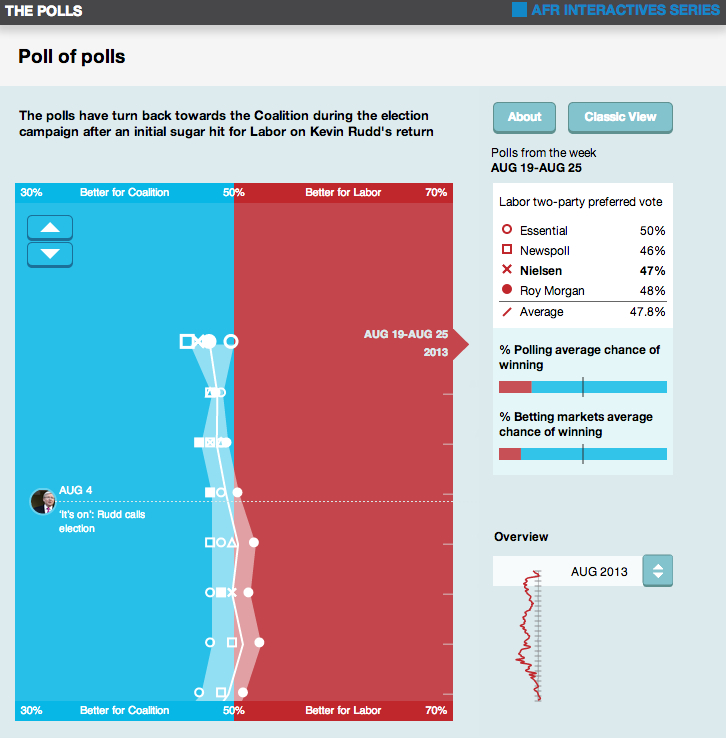
The Australian Financial Review’s Polling Explorer was designed to help make sense of the data deluge that accompanies every federal budget. The interactive features five modules tackling a different major element of the budget. It was produced with the fine data visualisation experts from Small Multiples.
Poll of Polls
This interactive graphic combines nine sources of election information into one visualisation. The design only uses the Labor two-party preferred polling data and presents this vertically. A simple weighted average of the polls is used to produce a weekly average. On the right-hand side the average poll result is converted into a probability and below this is an averaged betting market probability. The idea is that readers can get a quick update on the state of the polls and how they compare with the betting market assessment. They can then dive into the information by selected one or more poll to track and seeing how it changes over time.
Feedback: A mention about the polling explorer is towards the end of this piece, “The war the bloggers won“, by Greg Jericho from Inside Story.
